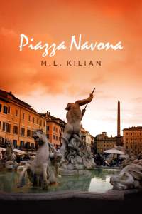
The story behind my book titles and the cover photo, I’d like to tell you about.
As you know, the key to getting your book read or even picked up to thumb though is having a captivating cover. And yes people actually do judge a book by the cover. I know this and I took a chance, picking covers and titles, which may not be dazzling or attention grabbing. But there is a reason for all of it.
Piazza Navona You see most of the story in book one unfolds in Piazza Navona – a charming city square in Rome formerly a stadium, was an ideal location for the story I wanted to tell. The fascinating piazza, rectangular in shape was once home to some of the most influential and prestigious people of Rome, including over the centuries, Popes and diplomats and also aristocrats. Now a tourist spot and a neighborhood for the wealthy. I travelled to Rome three times in two years in hopes of choosing the best cover for my novel. And suddenly while drinking a cappuccino at an outdoor cafe in Piazza Navona just taking it all in, it dawned on me that Fontana dei Quattro Fiumi (the main fountain in the middle) was probably the most dramatic part of the piazza and if photographed in the right light or setting, the image would express the turmoil the main character Elise felt throughout the story. So I snapped a dozen or more photographs, driving my travel partner absolutely mad with my obsession. However, when I returned to the states, I didn’t think I captured the right mood or angle. Stressing way too much over the fact, I missed my opportunity to get the true cover I was hoping for. And then I searched through a suggestion of photographs the publishing company introduced me to from their inventory, and my eyes lit up, when I saw the very cover I chose, and now here we are, mostly me being very hopeful that you approve.
Nob Hill: I had to keep the theme throughout, walking around Nob Hill trying to figure out which photo angle would best set the tone of book two. Then I noticed the fountain in the middle of the park there, while walking to it knowing it didn’t really define Nob Hill like Grace Cathedral, The Fairmont and The Mark Hopkins Hotels did. I snapped photos of it anyway, dozens of them, every light, every weather condition, clicking through each photo on my iPad trying to find just the right one, since part 2 focuses on Elise’s return to San Francisco from Rome, attempting to make a new life for herself centered around Nob Hill. The title was right. I knew it in my heart from the very beginning. The cover photo needed to fit, but it had to fit in a less dramatic way, blue skies I considered, expressing peacefulness, instead of the orange in Piazza Navona expressing turmoil. When I searched online for the meaning behind the fountain, I discovered, Fontana dell Tartarughe, on Nob Hill was a replica of a fountain in Rome, donated by William H. Crocker to the city of San Francisco. You can imagine my excitement, connecting the dots naturally from book 1 to book 2 by way of fountain, class, and everlasting characteristics, all relevant to my story. The photo is touched up, giving it a classic feel with Nob Hill under white skies, to reflect the famous San Francisco fog. Also Elise more at peace. And there you have it. The story behind the cover design.
{For information about my novels Piazza Navona click here. For information about Nob Hill, click here}


